Home » Blog » Are Dyslexia Fonts Helpful?
Are Dyslexia Fonts Helpful?
Written by Taylor Quinn
Published on September 24, 2024
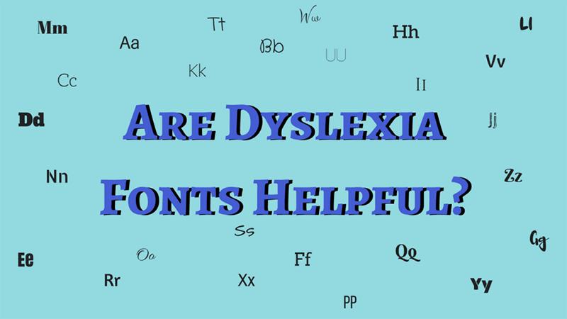
Dyslexia fonts, such as Dyslexie and OpenDyslexic, have attracted significant attention for their potential to help individuals with dyslexia read more easily. But the big question remains: are they actually helpful? While these fonts are designed to reduce reading errors by altering the shape and spacing of letters, there’s still a lack of conclusive, peer-reviewed research supporting their effectiveness.
Dyslexie’s creators have conducted internal studies that show some promise, but the findings have not yet been published in academic journals, making it difficult to validate these claims. Without rigorous, external testing, we can’t be certain how well these fonts truly work.
What’s important to note is that dyslexia fonts are not a cure or intervention for dyslexia. At best, they may make reading a little easier for some people by reducing visual confusion, but they don’t address the underlying neurological challenges of dyslexia. In this sense, dyslexia fonts should be seen as a supportive tool rather than a standalone solution.
How Dyslexia Fonts Differ from Traditional Fonts
Dyslexia fonts claim to make subtle adjustments that improve readability for individuals with dyslexia. According to organizations like understood.org, the designers of these fonts focus on making letters more distinct to prevent common reading errors. Here’s a breakdown of how they differ from traditional fonts:
- Thicker Lines: Parts of certain letters are made bolder or heavier. The idea is that by adding weight to specific areas of the letters, they’ll be less likely to appear flipped or reversed.
- Slanted Letters: In fonts like Dyslexie, some letters, such as the lowercase ‘L,’ are slanted to help differentiate them from other similar-looking characters, like uppercase ‘I.’ This slight tilt aims to make each letter more distinguishable, reducing visual confusion.
- Varying Letter Heights: Letters with tails and sticks—such as ‘b,’ ‘d,’ and ‘p’—are designed with different heights to further distinguish them from each other. By elongating or shortening certain letters, the font creators hope to prevent letter reversals.
What Dyslexia Fonts Can’t Do: Why Research-Based Interventions Matter
While dyslexia fonts may help with visual confusion, it’s crucial to understand their limitations. Dyslexia is a neurological condition that affects how the brain processes language, not just how it perceives letters on a page. As such, fonts, colored overlays, or even vision therapy do not offer long-term solutions to the core challenges of dyslexia.
The most effective way to help individuals with dyslexia improve their reading skills is through research-backed interventions, such as Structured Literacy with Lexercise. Unlike visual aids, Structured Literacy focuses on the fundamental skills required for reading, like phonemic awareness, decoding, and spelling. This method has been proven in multiple studies to be the most effective for individuals with dyslexia, as it targets the brain’s ability to process and understand written language.
If you’re looking for a real solution to dyslexia, focus on interventions that have been tested and proven through rigorous research. While dyslexia fonts might be a helpful tool to use in conjunction with these interventions, they should not be relied on as a primary method for addressing dyslexia.
Related Posts
- Five Ways Not to Treat Dyslexia | Part 1
- Five Ways Not to Treat Dyslexia | Part 2
- What Your Pediatrician Says About Vision Therapy
- 5 Incorrect Labels for Dyslexia
- Reading Tools That Don’t Work: Guessing
- Sight Word Practice Tips for Parents
- My Brain Is A Wordbox? How Your Brain Learns To Read
- Learning Methods and Note Taking Skills for Dyslexic Students
- Defining Dyslexia
- On Fonts, Fluency & Dyslexia
Improve Your Child’s Reading
Learn more about Lexercise today.
Schedule a FREE
15-minute consultation
Taylor Quinn
Blog & PR Intern
Taylor is a senior studying communication at NC State University. As the Blog and PR intern for lexercise she utilizes her passion for writing to help inform parents of struggling readers, writers and spellers. She feels a connection to Lexercise through her love for children and their well-being.


Leave a comment